Over the course of my career I have helped hundreds of churches with their web and graphic design. I have seen all the pitfalls, all the cliches, and all the different ways we boldly declare to the world “there is no commercial graphic artist in our midst!” I also have seen the path to vastly improving the design efforts of your good hearted volunteers. Whether it be bulletin design, sermon slides, lyric projections, or (especially) web graphics for your site and social media.
While very very few people have the expertise to tell you technical reasons that your graphic design is off-putting, everyone has a built-in appreciation for aesthetic, if even at the sub-conscious level. Poor graphic design will leave someone with a bad “feeling”, even if they aren’t consciously aware of it, or can’t articulate it.
If you are an untrained volunteer tasked with the creation of graphics for your organization, here are three things you can do that will take you miles down the road of communicating more effectively with your community.
1. Keep it extremely simple.
- Never, under any circumstances, use clip art.
- Unless you are a trained, commercially practicing, professional, don’t try to be too clever. When it comes to commercial graphic design, which is what you are doing here, straightforward and mildly boring is vastly superior to an untrained attempt at spontaneous creativity.
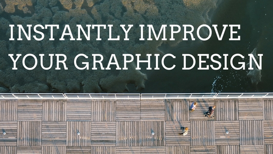
- Use professional, abstract photography as a background. Some really good sources: FREE: unsplash, neustock. PAID: lightstock.
- Only use one font, ever. For everything. After your initial font selection (see below), you should never spend any time choosing fonts. Pull the brakes immediately if you find yourself thinking “but this thing needs to be more fun, lets find something festive!”
2. Keep it consistent.
- Find an excellent font from a professional source that isn’t currently installed on your computer. Check out Font Squirrel and Google Fonts. Some of my favorite fonts are: Montserrat, Lato, Nexa, Raleway, Aleo, Arvo,
- Use that same font for everything. (I mean it. See above.)
- Make all of your web graphics look very very similar. (Use the same scheme for everything. If you decide to switch schemes, switch it for everything, and stick with it for a very long time.) Similar is good. Similar is not boring. Similar doesn’t mean dull and repetitive. It means cohesive and comprehensible.
3. Keep an eye on the pros.
- Keep an eye on what large organizations with trained professional graphic designers are doing. Compare your design to it. Change things accordingly.
- Keep an eye on national and internationally distributed print publications. Ignore what other local organizations are doing.
Some tools to help you.
Take a look at Canva (who offers a free package to 501c3 non-profits) and similar alternatives. These provide very helpful toolsets for creating a cohesive and excellent set of graphics (if you use them properly and in line with the above tips.)
I’d be happy to give you some brutally honest feedback on your creation if you’ll let me. I’d do it in love and in the spirit of helping you move your organization forward. Drop me a line.